Resources and Links
Society of Physics Students |
||

Previous Assessment Results
|
Fall Semester 2020 Student Assessments
General Education Competencies:
This year, we will complete a Visual Communication assessment and a Teamwork assessment.
All courses in the core curriculum must assess the general education competencies by completing the Visual Communication and the Teamwork assessments. The courses in the core curriculum are ASTR 1303, 1304, 1403 & 1404 along with PHYS 1401, 1402, 1405, 1407, 2425 & 2426, i.e., all ASTR & PHYS with the exceptions of PHYS 1410 and all ENGR courses.
TEAMWORK ASSESSMENT
Physics and Astronomy Courses
We will apply the Teamwork assessment. The Teamwork assessment will be deployed on Blackboard by each faculty member. Complete instructions on deploying the assessment are found here. You will need to also download the attached document titled ‘Teamwork Assessment’ to be able to deploy the assessment.
VISUAL COMMUNICATION ASSESSMENT
Physics and Astronomy Lab courses
We will also apply the new Visual Communication to a graph from a lab. These classes will also report additional data (final letter grades, HW scores and/or attendance) as has been done in the past. The complete instructions for the Visual Communication assessment can be downloaded here.
Reporting of Visual Communication Results:
Please copy the REVISED spreadsheet template and enter the scores from the students into the rows under the appropriate column of the spreadsheet for the assessment being run. Please submit one spreadsheet per section taught.
Please title each assessment as shown below:
Instructor Last Name Course Abbreviation Course Number-Synonym-Section F20”.
Example: ARELLANO PHYS 1405-09682-010 F20
When you have filled out the spreadsheet, please send it to June Mullin (jmullin@austincc.edu).
ASTR 1403 & 1404, PHYS 1401, 1402, 1405, 1407, 2425 & 2426
The LAB courses: ASTR 1403 & 1404, PHYS 1401, 1402, 1405, 1407, 2425 & 2426 will apply the Visual Communication assessment to a graph from a lab report. For ASTR 1403 & 1404 and PHYS 1405 & 1407, the lab may be a group lab report - but you must report the results for each individual student (even if they are the same for all members of the lab group).
Visual Communication Assessment
- Axis Titles (Examples of each type are found on pages 5 and 6)
Points Earned |
Description of component for Axis Titles |
0pts |
Both axes are unlabeled with no units |
1pt |
There are labels or units on the axes, but the labels and units are incorrect |
2pts |
One axis is correctly labeled, but missing or incorrect units |
3pts |
Both axes are correctly labeled, but missing or incorrect units |
4pts |
Both axes are correctly labeled, but only one axes has correct units or both axes are labeled, and axes have correct units, but axes labels are inverted |
5pts |
Everything is correct |
- Data points and trendline (Examples of each type are found on pages 7 through 9)
Points Earned |
Description of component for Data points and trendline |
0pts |
Incorrect style of graph or graph with lines but not visible data points |
1pt |
Identifiable data points only |
2pts |
Identifiable and correct data points only |
3pts |
Data points with a trendline, but either trendline is not correct or data includes erroneous data points |
4pts |
Data points with trendline, but missing or incorrect equation of trendline |
5pts |
Everything is correct |
- Graph Title (Examples of each type are found on pages 10 and 11)
Points Earned |
Description of component for Graph Title |
0pts |
No title |
1pt |
Incorrectly titled |
2pt |
Title is not wrong, but does not appropriately communicate the lab concept |
3pts |
Correctly titled |
- Formatting (Examples of each type are found on pages 12 and 13)
Points Earned |
Description of component for Formatting |
0pts |
Disorganized or chaotic or illegible or not easy to read |
1pt |
Not scaled appropriately with data or data set is not distinguishable |
2pts |
Everything is correct |
Examples for each type of point component for Axis Title
0 points
No labels on either axis (shown)
1 point
Labels, but labels do not correctly define quantity (shown)
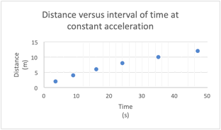
Another example is using units as the title of each axis, as shown on the x-axis of this example graph
2 points
One axis has the correct label for the quantity it represents, but is missing units and the other axis information is incorrect or missing (shown)
3 points
Each axis has the correct label for the quantity it represents, but is missing units (shown)
4 points
Each axis has the correct label for the quantity it represents, but one axis is missing units (shown)
The other option is axes are correctly labeled and have the correct units, but the labels and units are on the wrong axes.
5 points
Each axis has the correct label for the quantity it represents, but is missing units (shown)
Examples for each type of point component for Data points and Trendline
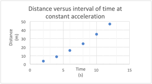
0 points
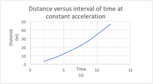
A line graph is used instead of plotting the data and fitting a trendline. Also, data points are not visible (shown)
It could also be the graphs is a bar graph instead of a required linear, or non-linear, trendline
1 point
Data points are identifiable, but it is apparent that the data points are inverted. Also, a trendline is not provided (shown)
Other cases are where graphed data is not converted to correct units prior to being plotted, or point is an erroneous point such as a student typing 0.3 instead of 3.0
2 points
Data points are identifiable and correct, but a trendline is not provided (shown)
Another case is data points are identifiable and correct, but an incorrect trendline is provided
3 points
Data points are identifiable and correct, but the trendline is incorrect (shown)
Another case is data points are identifiable and trendline is correct for the data points that are plotted, but one or more data points are erroneous (e.g. A student types 0.3 instead of 3.0 for one of the points)
4 points
Data points are identifiable and correct and trendline is correct and provided, but equation of trendline is not provided (shown)
Another case is the equation of the trendline is incorrect. Perhaps the student was able to fit a power function trendline and the power function trendline fit the data and provided a power function as the trendline, but the correct equation was a polynomial because the way the experimental was conducted
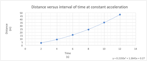
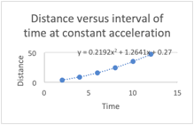
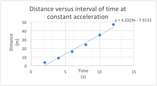
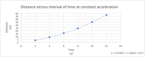
5 points
Data points are identifiable and correct, trendline is correct and provided, and equation of trendline is provide (shown)
Examples for each type of point component for Graph Title
0 points
No title (shown)
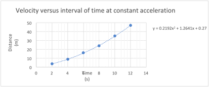
1 point
Title is provided, but it is an incorrect title for the graph (shown)
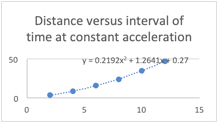
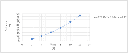
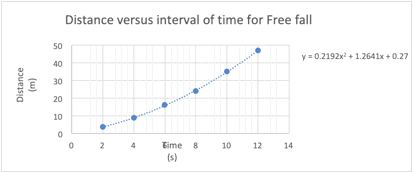
2 points
Title is provided, but the title does not effectively and/or correctly communicate the lab concept. For the data in this example, it can be seen from the equation of the trendline the lab is not a Free fall lab since the leading coefficient does not compare well with half the acceleration due to gravity (shown)
Another case is stating “Time versus Distance” or just “Distance versus Time”
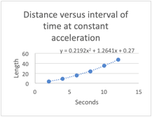
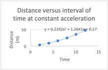
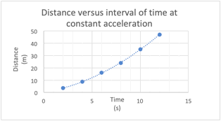
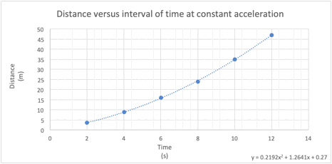
3 points
Title is provided and title effectively communicates lab concept (shown)
Examples for each type of point component for Formatting
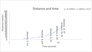
0 points
Graph is disorganized. The axes, or one of the axes, are not scaled to fit within range of data which leaves too much white space in the graph. The axes have too many tick marks labeled to distinguish the data in the graph. Data points are labeled with values, but values clutter the graph. Data points are not easily distinguishable due to the use of an incorrect marker (shown)
Overall, this is your call on whether you find the graph to be disorganized
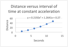
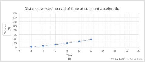
2 points
Graph is not scaled withing range of data (shown)
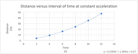
3 points
Graph is well organized (shown)